from PIL import Image
from matplotlib.offsetbox import OffsetImage, AnnotationBbox
from wordcloud import WordCloud
from nltk.corpus import stopwords
from sklearn.manifold import TSNE
from sklearn.decomposition import PCA

import pandas as pd
import numpy as np
import matplotlib.pyplot as plt
import nltk
import jsonDutch general elections are coming up at the end of this month. A lot of people in the Netherlands use the Stemwijzer website to figure out which political party to vote for. You answer 30 statements with Eens (agree), Oneens (disagree), or Geen van beide (neutral), and it shows which parties align most with your answers.
For each statement you can see which political parties agree, disagree, or are neutral about it, and why.
Still, even with tools like this, voting often feels like picking the least bad option. That frustration got me wondering: how different are these parties, really? And in what way? To explore that, I scraped the positions of the various parties on those statements to do some data exploration. I’ll visualize parties in 2D using t-SNE to see if any clusters arise. I’ll also perform a PCA and try to interpret the first two principal components and map them to underlying ideologies.
How the data was collected
I wrote a Python script that scrapes the party responses to the 30 statements from the Stemwijzer website. For each statement we get:
- The theme (broad topic label)
- The statement text
- A short info blurb
- Each party’s stance: Eens (agree), Oneens (disagree), Geen van beide (neutral)
- A short explanation per party (why they answered that way)
The script saves the scraped data as tweedekamer2025.json.
Importing libraries
We are going to need the following dependencies.
Loading the JSON
We start our analysis by loading the JSON file produced by the scraper. Each entry contains a statement plus per‑party responses. We’ll reshape it into a dataframe where each row is one issue and columns hold party positions and their explanation texts.
with open('tweedekamer2025.json', 'r', encoding='utf-8') as f:
    data = json.load(f)

# We flatten the 'positions' list, keeping 'theme', 'title', and 'info' as identifying metadata.
df_long = pd.json_normalize(
    data,
    record_path='positions',
    meta=['theme', 'title', 'info']
)

# Rename the columns for clarity before pivoting
df_long['position_col'] = df_long['party'] + '_position'
df_long['explanation_col'] = df_long['party'] + '_explanation'

# We create one table for 'position' data
df_position = df_long.pivot_table(
    index=['theme', 'title', 'info'],
    columns='position_col',
    values='position',
    aggfunc='first'
).reset_index()

# We create a second table for 'explanation' data
df_explanation = df_long.pivot_table(
    index=['theme', 'title', 'info'],
    columns='explanation_col',
    values='explanation',
    aggfunc='first'
).reset_index()

# We merge on the common descriptive columns: 'theme', 'title', and 'info'
df_merged = pd.merge(
    df_position,
    df_explanation,
    on=['theme', 'title', 'info']
)

# Sort the columns to get party columns adjacent (e.g., SP_position, SP_explanation)
party_cols = [col for col in df_merged.columns if col not in ['theme', 'title', 'info']]
party_cols.sort(key=lambda x: (x.split('_')[0], x.split('_')[1] == 'explanation'))

# Combine the descriptive columns with the sorted party columns
final_columns = ['theme', 'title', 'info'] + party_cols
df_final = df_merged[final_columns]
A quick peek at the data
Before diving into visualizations let’s sanity‑check what we have so far:
Let’s look at the first few rows.
df_final.head()| theme | title | info | 50PLUS_position | 50PLUS_explanation | BBB_position | BBB_explanation | BIJ1_position | BIJ1_explanation | BVNL_position | ... | SP_position | SP_explanation | VVD_position | VVD_explanation | Volt_position | Volt_explanation | Vrede voor Dieren_position | Vrede voor Dieren_explanation | Vrij Verbond_position | Vrij Verbond_explanation | |
|---|---|---|---|---|---|---|---|---|---|---|---|---|---|---|---|---|---|---|---|---|---|
| 0 | Aanwezigheid bij demonstratie | De politie moet bijhouden wie aanwezig is bij ... | In Nederland heb je het recht om te demonstrer... | Eens | Betere handhaving en strenger optreden bij ove... | Oneens | Standaard moeten bijhouden wie een verboden de... | Oneens | Iedereen moet veilig kunnen demonstreren. Het ... | Oneens | ... | Oneens | Demonstreren is een grondrecht. Iedereen heeft... | Eens | De VVD wil dat de politie alle mogelijkheden k... | Oneens | Volt beschermt het recht op protest. Demonstra... | Oneens | Demonstratierecht is een groot goed. | Oneens | Vrij Verbond kiest voor maximale bescherming v... |
| 1 | Abortus | Abortus moet uit het Wetboek van Strafrecht . | Abortus is het afbreken van een zwangerschap d... | Eens | 50PLUS ziet abortus niet als strafrecht maar m... | Oneens | Abortus hoort in het Wetboek van Strafrecht th... | Eens | Abortus is een mensenrecht en hoort bij basisg... | Oneens | ... | Eens | Abortuszorg is zorg en hoort daarom niet thuis... | Eens | Abortus is geen misdrijf. Als VVD vinden we he... | Eens | Volt vindt dat vrouwen het recht hebben om ove... | Eens | Zelfbeschikking is geen misdaad maar een recht. | Eens | Abortus is een medische keuze, geen misdaad. V... |
| 2 | Bouwen op landbouwgrond | De regering moet het bouwen van woningen op la... | Gemeentes die woningen willen laten bouwen, mo... | Eens | Als een paar % van de totale landbouwgrond voo... | Oneens | Onze vruchtbare landbouwgrond is waardevol. BB... | Eens | Met name de (melk)veehouderij neemt ontzettend... | Oneens | ... | Eens | De woningnood is groot en vraagt om nieuwe bou... | Eens | De VVD wil flink schrappen in het aantal bouwr... | Eens | Volt wil sneller woningen bouwen, ook op landb... | Eens | We willen landbouwgrond voor 90% omzetten in n... | Eens | Meer woningen zijn hard nodig. Laat grondeigen... |
| 3 | Controle op religieuze les | De overheid moet strenger controleren wat jong... | De overheid heeft regels gemaakt voor scholen ... | Eens | Onderwijs controle wordt uitgevoerd door de in... | Eens | Buitenlandse mogendheden steken graag hun lang... | Oneens | De surveillance van religieuze groepen belemme... | Eens | ... | Eens | Iedereen mag geloven wat hij wil, maar onderwi... | Eens | Voor het aanleren van onvrije waarden is in ge... | Oneens | Volt staat voor gelijke behandeling. Discrimin... | Oneens | Nederland heeft vrijheid van godsdienst. | Oneens | Vrijheid van onderwijs en geloof staat centraa... |
| 4 | Eigen risico zorgverzekering | Het eigen risico bij zorgverzekeringen wordt p... | In Nederland ben je verplicht een zorgverzeker... | Oneens | Dit leidt tot toename koopkracht. Zeer wenseli... | Oneens | Het is belangrijk dat zorg toegankelijk en bet... | Oneens | We zetten een Nationaal Zorgfonds op dat de pr... | Eens | ... | Oneens | Het eigen risico is een boete op ziek zijn. Da... | Eens | Het eigen risico is voor ons belangrijk om de ... | Eens | Volt wil dat zorg betaalbaar blijft voor ieder... | Oneens | De zorg moet voor iedereen betaalbaar zijn. | Eens | Vrij Verbond kiest voor een eerlijk zorgstelse... |
5 rows × 51 columns
Each row equals one statement (issue) from Stemwijzer. For every party we have two columns: one categorical position (_position) and one short text explanation (_explanation).
We should have 30 issues for 24 parties.
num_parties = len([col for col in df_position.columns if col.endswith('_position')])
num_issues = df_position.shape[0]

print(f"Number of parties: {num_parties}")
print(f"Number of issues: {num_issues}")
Number of parties: 24
Number of issues: 30What do the various parties think about each issue?
We’ll plot a bar chart per statement showing counts of parties that agree, disagree, or stay neutral.
We add logos to each bar so we can see which party thinks what.
# List of parties in the order they appear in the image
parties = [
    'PVV', 'GroenLinks-PvdA', 'VVD', 'NSC', 'D66', 'BBB', 'CDA',
    'SP', 'DENK', 'Partij voor de Dieren', 'FvD', 'SGP', 'ChristenUnie',
    'Volt', 'JA21', 'Vrede voor Dieren', 'BVNL', 'BIJ1', 'Libertaire Partij',
    '50PLUS', 'Piratenpartij', 'FNP', 'Vrij Verbond', 'De Linie'
]

# Load the image
img = Image.open('parties.png')

# Get image dimensions
width, height = img.size

# Find the logo's height:
num_parties = len(parties)
logo_height = height // num_parties

# Cut each logo and store in a dictionary
party_logos = {}
for i in range(num_parties):
    top = i * logo_height
    bottom = (i + 1) * logo_height
    logo = img.crop((0, top, width, bottom))
    party_logos[parties[i]] = logo
Next we create a bar chart for each of the 30 issues.
# Get all party position columns
position_cols = [col for col in df_position.columns if col.endswith('_position')]

# Plotting
fig, axes = plt.subplots(10, 3, figsize=(12, 60), constrained_layout=True)
axes = axes.flatten()

def text_wrap(text, width=40):
    """Wrap text at word boundaries."""
    import textwrap
    return "\n".join(textwrap.wrap(text, width=width))

def bold_text_with_spaces(text):
    """Make text bold while preserving spaces"""
    return ' '.join(f'$\\mathbf{{{word}}}$' for word in text.split())

def add_party_logos(ax, row):
    """Add party logos for each position"""
    y_offsets = [0] * 3  # Track y-offset for each column (Eens, Oneens, Geen van beide)

    # First, count how many parties are in each position to calculate bar heights
    counts = {'Eens': 0, 'Oneens': 0, 'Geen van beide': 0}
    for pos in [val for col, val in row.items() if col.endswith('_position')]:
        if pd.notna(pos):
            counts[pos] += 1

    # Draw the bars
    x = np.arange(3)
    ax.bar(x, [((counts['Eens'] + 1) // 2) * 2.2, ((counts['Oneens'] + 1) // 2) * 2.2, ((counts['Geen van beide'] + 1) // 2) * 2.2],
           color='white', edgecolor=['green', 'red', 'grey'], alpha=0.8, width=0.65)
    # Add counts to the top of each bar (except when count is 0)
    for idx, (label, count) in enumerate(counts.items()):
        if count > 0:
            ax.text(
                idx,
                ((count + 1) // 2) * 2.2 + 0.2,
                str(count),
                ha='center',
                va='bottom',
                fontsize=12,
                fontweight='bold'
            )

    # Now add logos
    for party, pos in [(col.replace('_position', ''), val) for col, val in row.items() if col.endswith('_position')]:
        if party in party_logos and pd.notna(pos):
            if pos == 'Eens':
                x = 0
            elif pos == 'Oneens':
                x = 1
            else:  # Geen van beide
                x = 2

            # Convert logo to array and add to plot
            logo = party_logos[party]
            imagebox = OffsetImage(logo, zoom=0.2)
            if y_offsets[x] % 2 == 0:
                shift_x = x + 0.15
            else:
                shift_x = x - 0.15
            y = (y_offsets[x] // 2) * 2.2 + 1.1
            ab = AnnotationBbox(imagebox, (shift_x, y),
                              frameon=False,
                              box_alignment=(0.5, 0.5))
            ax.add_artist(ab)
            y_offsets[x] += 1

for i, ax in enumerate(axes):
    if i < len(df_position.index):
        row = df_position.iloc[i]

        # Set theme as main title and wrapped title as subtitle
        ax.set_title(
            f"{bold_text_with_spaces(row['theme'])}\n{text_wrap(row['title'])}",
            fontsize=10,
            pad=15,
            wrap=True
        )

        # Set up the axes
        ax.set_xlim(-0.5, 2.5)
        ax.set_ylim(0.0, len(position_cols))
        ax.set_xticks([0, 1, 2])
        ax.set_xticklabels(['Eens', 'Oneens', 'Geen van beide'], rotation=0)

        # Add party logos
        add_party_logos(ax, row)

        # Remove y-axis
        ax.set_yticks([])
    else:
        ax.axis('off')

plt.suptitle('Distribution of party positions per theme', fontsize=16)
plt.show()
The theme of Illegaal verblijf (“Illegal stay”) is the most divisive issue, with an even split of parties agreeing and disagreeing. Conversely, the Heffing op plastic (“Plastic tax”) is the least divisive, showing a strong consensus among most parties.
What reasons do parties give when they explain their positions?
To get an idea of what some reasons are for agreeing or disagreeing with a statement I’ll plot a word cloud for each issue. In word clouds the size of a word indicates how frequently this word is used.
We remove stopwords to make sure the word clouds aren’t crowded with irrelevant words.
# Ensure NLTK stopwords are downloaded and get Dutch stopwords
nltk.download('stopwords')
dutch_stopwords = set(stopwords.words('dutch'))
[nltk_data] Downloading package stopwords to /home/aswin/nltk_data...
[nltk_data] Package stopwords is already up-to-date!I’m color coding the words as follows: A word is shown in green if it’s more frequently used among agreeing parties and in red if disagreeing parties use this word more.
def generate_color_func(agree_words, disagree_words):
    """Generate a color function based on word frequencies in agree/disagree groups"""
    def color_func(word, **kwargs):
        # Get frequencies (default to 0 if word not in dict)
        agree_freq = agree_words.get(word, 0)
        disagree_freq = disagree_words.get(word, 0)

        # Calculate ratio (avoiding division by zero)
        total = agree_freq + disagree_freq
        if total == 0:
            return 'grey'

        ratio = agree_freq / total

        # Create RGB color based on ratio (green to red gradient)
        r = int(255 * (1 - ratio))
        g = int(255 * ratio)
        b = 0

        return f'rgb({r}, {g}, {b})'
    return color_func

def create_word_frequencies(text_list):
    """Create word frequency dictionary from list of texts"""
    from collections import Counter
    import string

    # Create translation table to remove punctuation
    translator = str.maketrans('', '', string.punctuation)

    words = []
    for text in text_list:
        if isinstance(text, str):
            # Remove punctuation and split into words
            clean_text = text.translate(translator)
            # Split text into words and filter out stopwords
            words.extend([word.lower() for word in clean_text.split()
                         if word.lower() not in dutch_stopwords
                         and len(word) > 2])
    return Counter(words)
# Create word clouds for each issue
fig, axes = plt.subplots(6, 5, figsize=(18, 23))
axes = axes.flatten()
for idx, (_, row) in enumerate(df_final.iterrows()):
if idx >= len(axes):
break
# Get explanations for parties that agree and disagree
agree_explanations = []
disagree_explanations = []
for party in parties:
pos_col = f'{party}_position'
exp_col = f'{party}_explanation'
if pos_col in row and exp_col in row and pd.notna(row[pos_col]) and pd.notna(row[exp_col]):
if row[pos_col] == 'Eens':
agree_explanations.append(row[exp_col])
elif row[pos_col] == 'Oneens':
disagree_explanations.append(row[exp_col])
# Create word frequencies for each group
agree_words = create_word_frequencies(agree_explanations)
disagree_words = create_word_frequencies(disagree_explanations)
# Combine all words for the word cloud
all_words = {}
for word in set(list(agree_words.keys()) + list(disagree_words.keys())):
all_words[word] = max(agree_words.get(word, 0), disagree_words.get(word, 0))
if all_words: # Only create word cloud if we have words
# Create and generate word cloud
wc = WordCloud(width=400, height=300, background_color='white',
color_func=generate_color_func(agree_words, disagree_words),
max_words=50)
wc.generate_from_frequencies(all_words)
# Display word cloud
axes[idx].imshow(wc, interpolation='bilinear')
axes[idx].axis('off')
axes[idx].set_title(
f"{bold_text_with_spaces(row['theme'])}\n{text_wrap(row['title'])}",
fontsize=10,
pad=15,
wrap=True
)
# Remove empty subplots
for idx in range(len(df_final), len(axes)):
axes[idx].axis('off')
plt.suptitle('Words used in party explanations\n(Green: Words from agreeing parties, Red: Words from disagreeing parties)',
fontsize=16, y=0.99)
plt.tight_layout()
plt.show()
When we, for instance, look at the word cloud for the issue of kerncentrales (“nuclear power plants”), parties that support building extra nuclear power plants, use words like reliable, stable, and clean, while opponents use words like costly, and slow refering to the building process.
How similarly do parties answer across all 30 statements?
For each pair we compute the % of statements where both gave the same response (agree, disagree, or neutral).
# Get the raw positions (without encoding)
df_positions = df_position[position_cols]

# Clean up party names by removing '_position' suffix
party_names = [col.replace('_position', '') for col in position_cols]

# Initialize agreement matrix with zeros, explicitly setting dtype to float64
agreement_matrix = pd.DataFrame(0.0, index=party_names, columns=party_names, dtype='float64')

# Calculate agreement percentages
for i, party1 in enumerate(position_cols):
    for j, party2 in enumerate(position_cols):
        # Get positions for both parties where neither is null
        mask = df_positions[party1].notna() & df_positions[party2].notna()
        positions1 = df_positions[party1][mask]
        positions2 = df_positions[party2][mask]

        if len(positions1) > 0:  # Only calculate if we have valid positions
            # Count where both agree:
            # - both Eens
            # - both Oneens
            # - both Geen van beide
            agreements = ((positions1 == 'Eens') & (positions2 == 'Eens')) | \
                        ((positions1 == 'Oneens') & (positions2 == 'Oneens')) | \
                        ((positions1 == 'Geen van beide') & (positions2 == 'Geen van beide'))

            # Calculate percentage
            agreement_pct = (agreements.sum() / len(positions1)) * 100

            # Store in matrix using cleaned party names
            agreement_matrix.iloc[i, j] = agreement_pct

# Round to 1 decimal place
agreement_matrix = agreement_matrix.round(1)
We use a heatmap to visualize the result.
plt.figure(figsize=(15, 15))
im = plt.imshow(agreement_matrix, cmap='RdYlBu', vmin=0, vmax=100)
plt.colorbar(im, fraction=0.046, pad=0.04, label='Agreement %')
plt.xticks(range(len(party_names)), party_names, rotation=90)
plt.yticks(range(len(party_names)), party_names)
plt.title('Percentage of issues on which parties agree')

# Add percentage text to each cell
for i in range(len(party_names)):
    for j in range(len(party_names)):
        text = plt.text(j, i, f'{agreement_matrix.iloc[i, j]}%',
                       ha='center', va='center')

plt.tight_layout()
plt.show()
Cells show % agreement. The 100% values on the main diagonal are expected, as a party always agrees with its own answers.
What parties are the most and the least in agreement with each other?
Ignoring the 100% self-agreement, what are the highest and lowest agreement pairs?
min_agreement = agreement_matrix.values.min()

# Find the second largest unique agreement value
unique_agreements = np.unique(agreement_matrix.values)
if len(unique_agreements) > 1:
    max_agreement = unique_agreements[-2]
else:
    max_agreement = unique_agreements[0]

print(f"Minimal agreement percentage: {min_agreement}%")
print(f"Maximal agreement percentage: {max_agreement}%")
Minimal agreement percentage: 13.3%
Maximal agreement percentage: 93.3%These are the parties with highest agreement levels:
# Find all party pairs with the second largest agreement
second_max_pairs = []
for i in range(len(party_names)):
    for j in range(i + 1, len(party_names)):
        if agreement_matrix.iloc[i, j] == max_agreement:
            second_max_pairs.append((party_names[i], party_names[j]))

for p1, p2 in second_max_pairs:
    print(f"{p1} ❤️ {p2}: {max_agreement}%")
BIJ1 ❤️ Piratenpartij: 93.3%The parties with the lowest agreement levels are:
# Find party pairs for min_agreement
party_pairs = []
for i in range(len(party_names)):
    for j in range(i + 1, len(party_names)):
        value = agreement_matrix.iloc[i, j]
        if value == min_agreement:
            party_pairs.append((party_names[i], party_names[j]))

for p1, p2 in party_pairs:
    print(f"{p1} 💔 {p2}: {min_agreement}%")
FvD 💔 GroenLinks-PvdA: 13.3%
PVV 💔 Volt: 13.3%We have to take into consideration that the statements on the Stemwijzer website are chosen such that we can differentiate between parties. It’s likely that on many issues, seemingly very dissimilar parties like the FvD and GroenLinks-PvdA, actually agree with each other. It wouldn’t make sense to use those issues as statements for Stemwijzer as they wouldn’t help a voter distinguish between parties.
Squeezing 30 issues into 2D using t-SNE
By encoding Eens (agree) as 1, Oneens (disagree) as -1, and Geen van beide (neutral) as 0, we transform each party’s stance into a quantifiable, 30-dimensional vector.
pd.set_option('future.no_silent_downcasting', True)

# Create encoded dataframe by mapping positions to numerical values
position_mapping = {
    'Eens': 1.0,
    'Oneens': -1.0,
    'Geen van beide': 0.0
}

# Get only the position columns and convert to numeric values
position_cols = [col for col in df_position.columns if col.endswith('_position')]
df_encoded = df_position[position_cols].copy()
df_encoded = df_encoded.replace(position_mapping)

# Convert to float64
df_encoded = df_encoded.astype('float64')
We can now project the parties into 2D using t-SNE (t-distributed Stochastic Neighbor Embedding).
The idea behind t-SNE is that local neighborhoods are reserved by making sure that points close together in original space stay close in 2D.
Let’s run it to see if clusters emerge.
# Prepare the encoded party positions
X = df_encoded.values

# Run t-SNE
tsne = TSNE(n_components=2, random_state=4, perplexity=5)
X_embedded = tsne.fit_transform(X.T)  # transpose so shape is (n_parties, n_issues)

# Plot the parties in 2D space
plt.figure(figsize=(10, 10))

# Add party logos and points
for i, name in enumerate(party_names):
    # Add the scatter point
    plt.scatter(X_embedded[i, 0], X_embedded[i, 1], color='white', edgecolor='black', s=100)

    # Add the party logo
    if name in party_logos:
        imagebox = OffsetImage(party_logos[name], zoom=0.25)
        ab = AnnotationBbox(imagebox, (X_embedded[i, 0], X_embedded[i, 1]),
                          frameon=False,
                          box_alignment=(0.5, 0.5))
        plt.gca().add_artist(ab)

    # Add party name below the logo
    plt.text(X_embedded[i, 0], X_embedded[i, 1] - 5.5, name,
             fontsize=8, ha='center', va='top')

plt.title('t-SNE visualization of party positions')
plt.xlabel('t-SNE dimension 1')
plt.ylabel('t-SNE dimension 2')
plt.grid(True)
plt.tight_layout()
plt.show()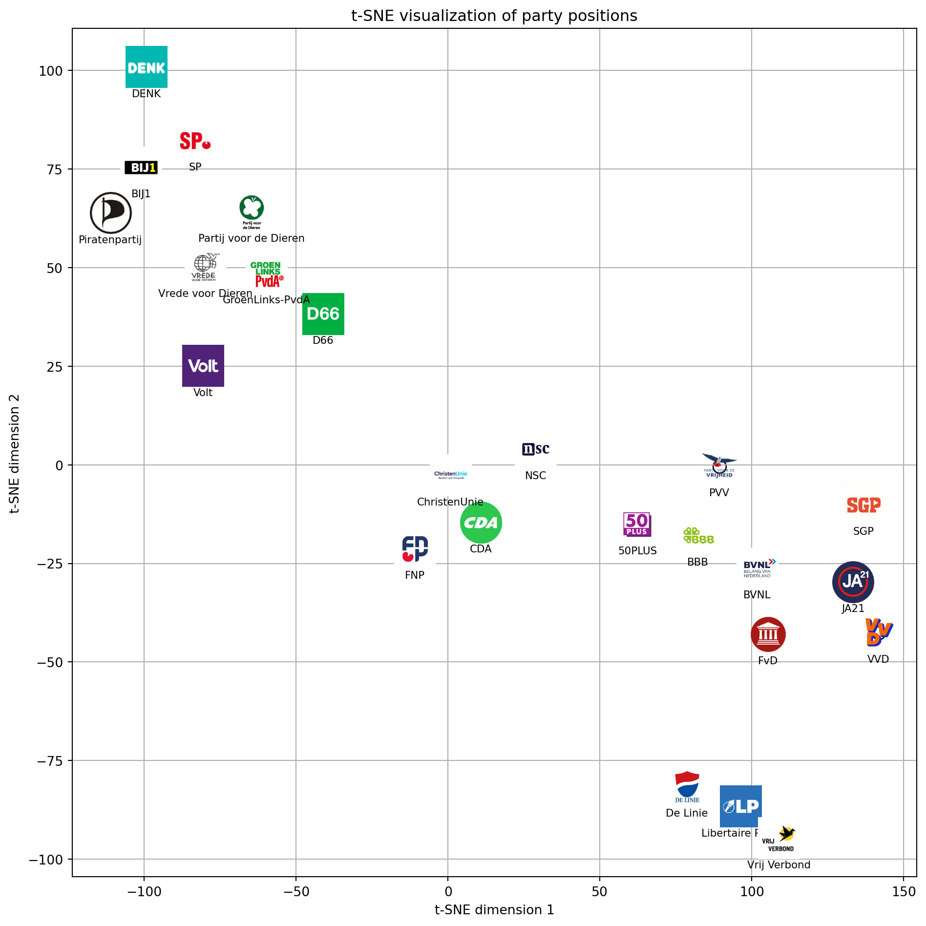
Nothing too surprising here. Parties that were similar in the heatmap above seem to lie closer together in this t-SNE plot as well. Two shortcomings of t-SNE are that it sometimes creates artificial spacing and that axes don’t really represent anything. Different runs produce different projections.
Doing a Principal Component Analysis (PCA)
PCA (Principal Component Analysis) finds orthogonal axes capturing maximal variance. In contrast to t-SNE, axes do have somewhat interpretable meanings. Early components might capture broad ideological splits. Let’s see if this is the case.
# Prepare the encoded party positions (already created in cell 13)
X = df_encoded.values

# Run PCA
pca = PCA(n_components=2, random_state=42)
X_pca = pca.fit_transform(X.T)  # transpose so shape is (n_parties, n_issues)

# Plot the parties in 2D space
plt.figure(figsize=(10, 10))
for i, name in enumerate(party_names):
    plt.scatter(X_pca[i, 0], X_pca[i, 1])

    # Add the party logo
    if name in party_logos:
        imagebox = OffsetImage(party_logos[name], zoom=0.25)
        ab = AnnotationBbox(imagebox, (X_pca[i, 0], X_pca[i, 1]),
                          frameon=False,
                          box_alignment=(0.5, 0.5))
        plt.gca().add_artist(ab)

    # Add party name below the logo
    plt.text(X_pca[i, 0], X_pca[i, 1] - 0.20, name,
             fontsize=8, ha='center', va='top')

plt.title('PCA visualization of party positions')
plt.xlabel('PCA dimension 1')
plt.ylabel('PCA dimension 2')
plt.grid(True)
plt.tight_layout()
plt.show()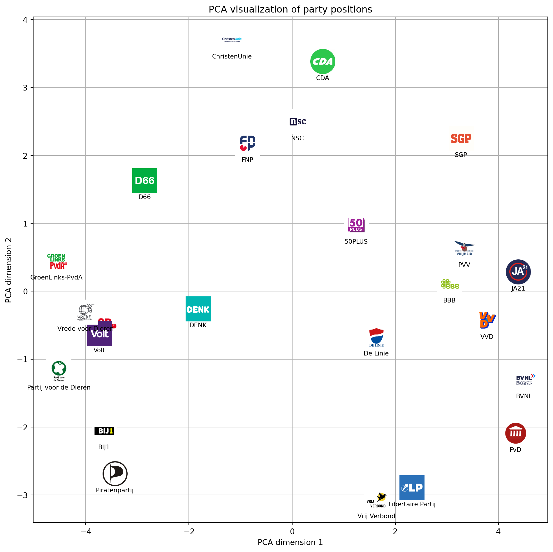
At first glance PC1 looks like a left–right axis, but we’ll validate that by inspecting which issues load strongly on it. PC2 might reflect a libertarian–authoritarian or progressive–traditional divide. We’ll try to interpret these components below.
How much variance do components capture?
The scree plot below shows how much variance is explained by each principal component (PC).
# Fit PCA with all possible components (up to number of parties)
pca_full = PCA(n_components=len(position_cols), random_state=42)
X = df_encoded.values
pca_full.fit(X.T)  # shape: (n_parties, n_issues)

# Explained variance ratio for each component
explained_variance = pca_full.explained_variance_ratio_

# Plot the explained variance ratio
plt.figure(figsize=(8, 5))
plt.plot(range(1, len(explained_variance) + 1), explained_variance, marker='o', label='Individual')
plt.plot(range(1, len(explained_variance) + 1), explained_variance.cumsum(), marker='s', label='Cumulative')
plt.xlabel('Number of PCA components')
plt.ylabel('Explained variance ratio')

# Annotate each bar with the percentage of explained variance
for i, v in enumerate(explained_variance):
    plt.text(i + 1, v + 0.005, f"{v*100:.1f}%", ha='center', va='bottom', fontsize=9)
plt.bar(range(1, len(explained_variance) + 1), explained_variance, color='skyblue')
plt.legend().remove()
plt.title('Explained variance by PCA components')
plt.legend()
plt.grid(True)
plt.tight_layout()
plt.show()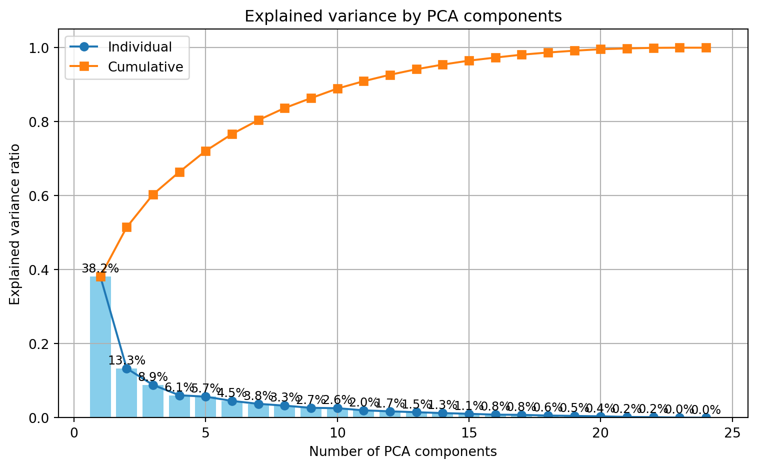
Most variance is captured by PC1 (38.2%). Explanatory power then drops quickly, but PC2 still captures 13.3% of the variance.
Interpreting the axes
Let’s look at the loading scores of the first two PCs.
# Get PCA loadings (components) for each issue on each factor
# Create DataFrame with loadings scaled by explained variance
loadings = pd.DataFrame(
    data=pca.components_.T * np.sqrt(pca.explained_variance_),
    columns=[f"PC{i}" for i in range(1, pca.n_components_ + 1)],
    index=df_position['theme']
)

fig, axs = plt.subplots(2, 1, figsize=(10, 8), sharex=True, sharey=True)
colors = ["#1C3041", "#9B1D20"]

for i, ax in enumerate(axs):
    if i >= pca.n_components_:
        ax.axis('off')
        continue

    explained_variance = pca.explained_variance_ratio_[i] * 100
    pc = f"PC{i+1}"
    bars = ax.bar(range(len(loadings.index)), loadings[pc], color=colors[i], edgecolor="#000000", linewidth=1.2)
    ax.set_title(f"{pc} Loading Scores ({explained_variance:.2f}% Explained Variance)", fontdict={"weight": "bold"}, pad=20)
    if i == len(axs) - 1:  # Only add xlabel to the bottom subplot
        ax.set_xlabel("Thema")
    ax.set_ylabel("Loading Score")
    ax.grid(axis="y")
    ax.set_xticks(range(len(loadings.index)))
    if i == len(axs) - 1:  # Only add x-tick labels to the bottom subplot
        ax.set_xticklabels(loadings.index, rotation=90, ha='right', fontsize=9)
    ax.set_ylim(-1, 1)

    for j, bar in enumerate(bars):
        yval = bar.get_height()
        if abs(yval) > 0.1:  # Only show labels for significant values
            offset = yval + 0.02 if yval > 0 else yval - 0.02
            ax.text(bar.get_x() + bar.get_width() / 2, offset, f"{yval:.2f}",
                   ha="center", va="bottom" if yval > 0 else "top", fontsize=7)

plt.tight_layout()
plt.show()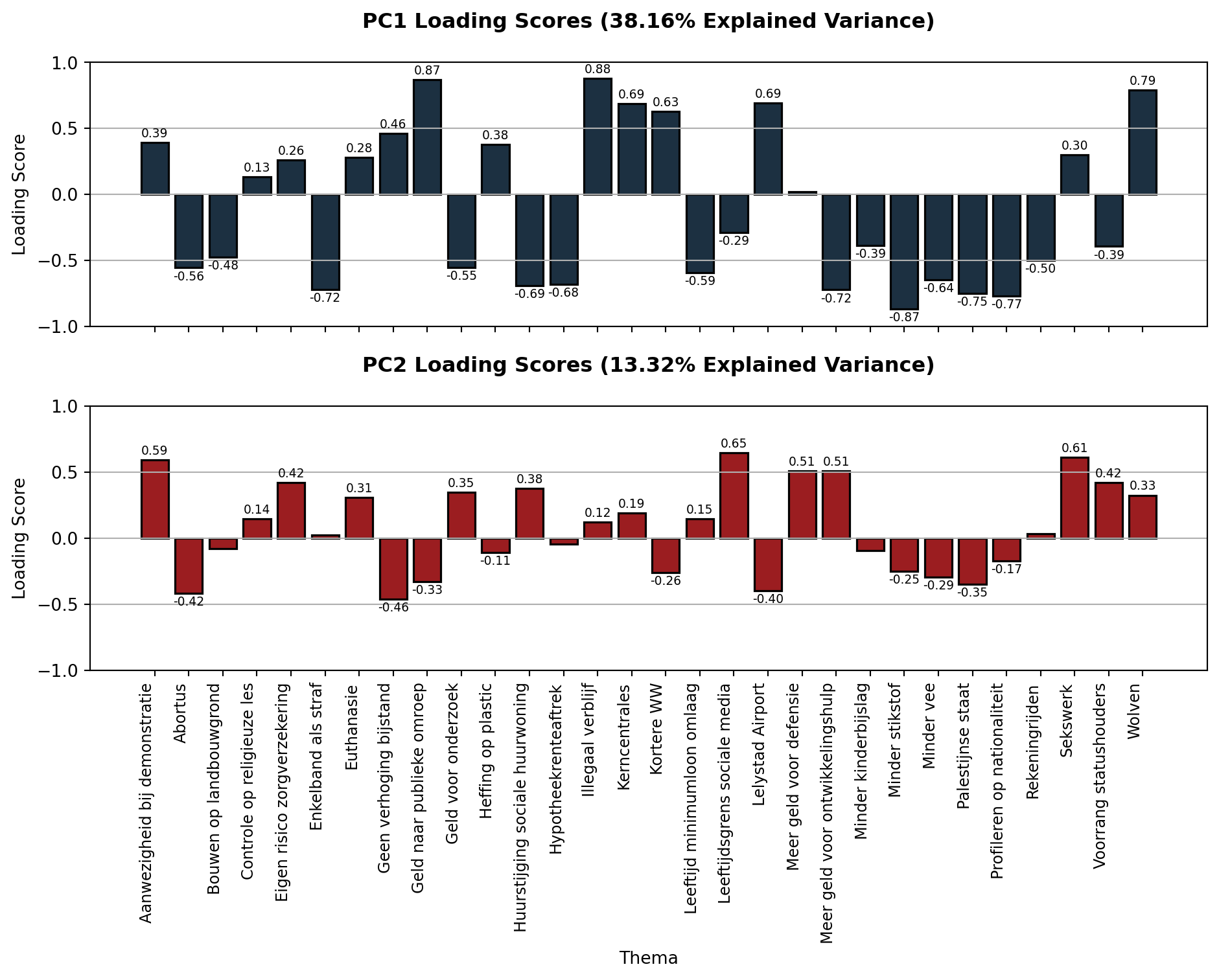
Strong loadings tell us which statements “pull” most on a component and can help us discover underlying ideological factors.
Let’s look at the five strongest absolute loadings of PC1 and PC2.
# Get absolute loadings for PC1 and PC2
pc1_loadings = loadings['PC1'].abs()
pc2_loadings = loadings['PC2'].abs()

# Get top 5 themes for each component
top5_pc1 = pc1_loadings.sort_values(ascending=False).head(5)
top5_pc2 = pc2_loadings.sort_values(ascending=False).head(5)

print("Top 5 most important themes for PC1:")
for theme in top5_pc1.index:
    print(f"- {theme} (loading: {loadings.loc[theme, 'PC1']:.2f})")

print("\nTop 5 most important themes for PC2:")
for theme in top5_pc2.index:
    print(f"- {theme} (loading: {loadings.loc[theme, 'PC2']:.2f})")
Top 5 most important themes for PC1:
- Illegaal verblijf (loading: 0.88)
- Geld naar publieke omroep (loading: 0.87)
- Minder stikstof (loading: -0.87)
- Wolven (loading: 0.79)
- Profileren op nationaliteit (loading: -0.77)
Top 5 most important themes for PC2:
- Leeftijdsgrens sociale media (loading: 0.65)
- Sekswerk (loading: 0.61)
- Aanwezigheid bij demonstratie (loading: 0.59)
- Meer geld voor defensie (loading: 0.51)
- Meer geld voor ontwikkelingshulp (loading: 0.51)PC1 loads strongly on issues like immigration, environmental rules, and cultural liberalism. In the past, “left” and “right” mainly referred to views on how much the state should intervene in the market. Today, though, these terms also seem to cover social and cultural topics like immigration, religion, and the environment. So I would say that PC1 does indeed reflect a Left-Right divide, however not the classic economic one.
PC2 loads primarily on issues involving social regulation, moral permissiveness, and authority (e.g., restrictions on social media use, sex work, and protest). I would therefor interpret it as an Libertarian-Authoritarian dimension, reflecting preferences for individual freedom and permissiveness versus state control and traditional morality.
Some final remarks
I want to end this post with a few remarks, a disclaimer of sorts.
I am not a political scientist. I tried to interpret the PCs to the best of my understanding, but someone more knowledgable might interpret the loading scores differently and come up with more accurate labels for the PCs.
I don’t know how the 30 issues on the Stemwijzer website are selected but it’s unlikely that they are an accurate representation of a party’s viewpoints. By reducing positions to three possible answers we lose any nuance in a party’s stance. Furthermore, the 30 issues are selected in such a way that they are discriminative: They’re meant to help you choose between parties. It’s likely that parties are more similar than the distance matrix/heatmap above suggests.
Another thing to keep in mind is that when parties supply their positions to the Stemwijzer website, they likely do so strategically by aligning with what they think most voters would prefer. They’re trying to rake in votes and might misrepresent their actual stance on certain issues. Politicians can be manipulative and dishonest. Shocking, I know.
Despite these shortcomings, I did find it insightful to see how the Stemwijzer data shows underlying left-right and libertarian-authoritarian axes. It helped me realize that my vote shouldn’t just be about agreeing or disagreeing with a list of statements, but also about what level of left-right/libertarian-authoritarian I’m comfortable with.
You can find the code for both the analysis and webscraper in the following GitHub repository:
![]()
Don’t forget to vote!