from PIL import Image
from rembg import remove
from IPython.display import display, clear_output
from sklearn.cluster import KMeans

import matplotlib.pyplot as plt
import ipywidgets as widgets
import numpy as np
import squarify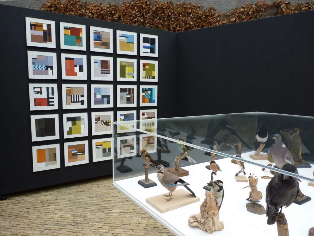
import randomA few years ago, I visited the BLOCBIRDS exhibition while it was on display at the Frisian Museum of Natural History. The exhibition featured 25 compositions, each one inspired by different bird species and crafted entirely from rectangular shapes.
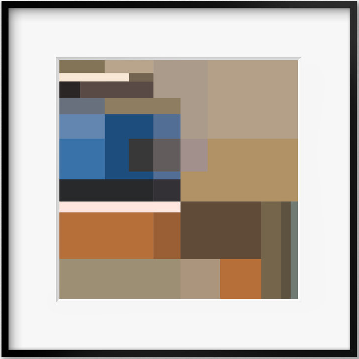
Each composition represents the colors and proportions of a bird’s plumage. Take for example the composition based on the Bluethroat bird species.
In this blog post, we’ll explore how to use machine learning to create similar avian-inspired art.
Importing libraries
We’ll start by importing some libraries.
The rembg module implements U²-Net, a neural network architecture that performs Salient Object Detection. Salient object detection is a computer vision technique that aims to identify the most visually significant objects or regions in an image. We will use it to separate the bird we’re interested in from the background.
We will use KMeans to extract the color palette. The squarify module is needed to plot the artwork.
Loading an image and removing the background
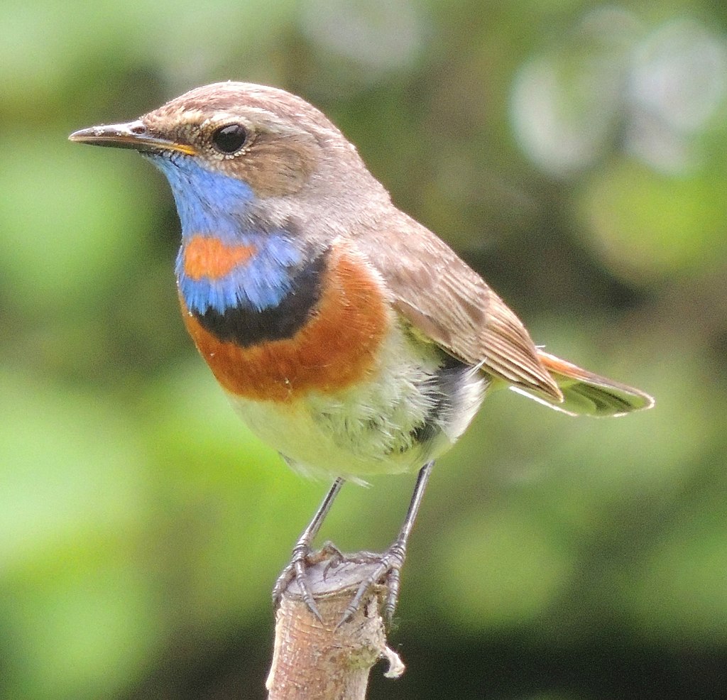
We’ll start by loading an image of the Spangled cotinga which I got from here.
image = Image.open("spangled-continga.jpg")
image
To create a BLOCBIRDS-like artwork based on this image of this colorful bird, we need to extract its color palette while excluding the background. We can achieve this by utilizing the aforementioned rembg module, which allows us to remove the background and focus solely on the bird’s plumage. The algorithm makes all irrelevant pixels transparent.
image = remove(image)
image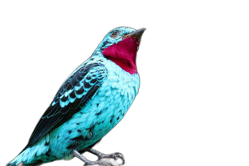
Notice how it even removes the branch the bird was perching on.
Extracting the palette
K-means clustering can be used to extract dominant colors from an image. The idea is to group the pixels of the image into k clusters based on their color similarity. The algorithm then computes the average color of each cluster and assigns it as the representative color for that cluster. These representative colors can be used to create a color palette for the image.
Getting the pixels
We first need to extract the pixels from our image. To do this we first convert the PIL image to a numpy array.
np_image = np.array(image)This numpy array will have the same dimensions as the image. Next we select all pixels that aren’t transparent.
h, w, d = np_image.shape
if d == 4:
    pixels = np_image[np_image[:,:,3] == 255]
    pixels = pixels[:,:3]
else:
    pixels = np_image.reshape((h * w, d))
Determining the colors
Before applying k-means clustering, we must determine the number of clusters, denoted by k, that we want to generate. This value represents the desired number of colors in the final palette. In this case, we will use 12 clusters or colors, although determining the ideal number is a matter of taste and some experimentation.
n_clusters = 12Once we have defined these parameters, we can apply the k-means algorithm to the pixel data of the image. Euclidean distance is used as a distance metric.
# cluster pixels
clt = KMeans(n_clusters=n_clusters, n_init='auto')
clt.fit(pixels)
KMeans(n_clusters=12, n_init='auto')In a Jupyter environment, please rerun this cell to show the HTML representation or trust the notebook.
On GitHub, the HTML representation is unable to render, please try loading this page with nbviewer.org.
KMeans(n_clusters=12, n_init='auto')
The algorithm iteratively assigns each pixel to the nearest cluster center, updates the cluster centers based on the new pixel assignments, and repeats this process until convergence. At convergence, we have the k cluster centers or centroids which represent the dominant colors in the image.
To translate these centroids to actual colors we use a helper function.
def rgb_to_hex(r, g, b):
    return "#{:02x}{:02x}{:02x}".format(r, g, b)
We then extract all colors and also the number of pixels that fall within that cluster.
colors = [rgb_to_hex(int(r), int(g), int(b)) for r, g, b in clt.cluster_centers_]
_, sizes = np.unique(clt.labels_, return_counts=True)
Plotting our art
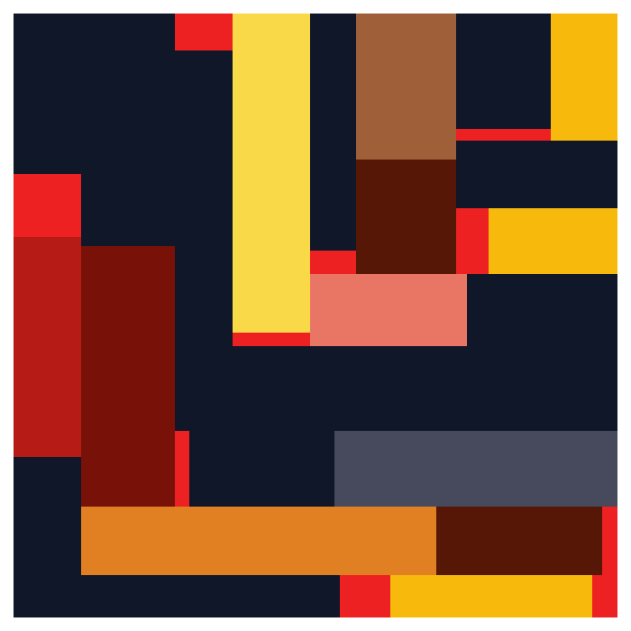
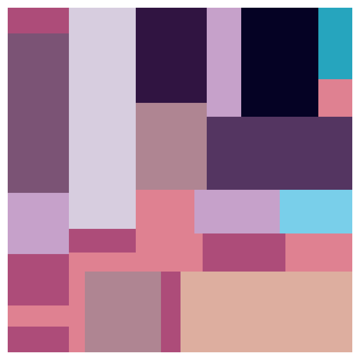
Finally, we can use these extracted colors and number of pixels per color to plot our artwork.
fig, ax = plt.subplots(figsize=(7,7))
squarify.plot(sizes=sizes, color=colors, ax=ax)
ax.axis('off')
plt.show()
Beautiful! Wouldn’t you agree?
Customizing the composition
The way the squarify function plots the rectangles is influenced by the order of elements in the colors and sizes lists. By shuffling these two lists, we can experiment with different compositions.
squares = list(zip(sizes, colors))
random.shuffle(squares)
shuffled_sizes, shuffled_colors = zip(*squares)
Now, we can visualize a new composition based on these shuffled lists.
fig, ax = plt.subplots(figsize=(7,7))
squarify.plot(sizes=shuffled_sizes, color=shuffled_colors, ax=ax)
ax.axis('off')
plt.show()
Splitting up the rectangles
In our plots every color gets represented by exactly one rectangle. In the BLOCBIRDS` compositions multiple rectangles can have the same color. To play around with this we can create a set of sliders, one for each color and use these to set the number of rectangles that a color can use.
sliders = [widgets.IntSlider(value=1, min=1, max=20, style={'handle_color': color}) for color in colors]

update_button = widgets.Button(description='Update')

output = widgets.Output()

vbox = widgets.VBox(sliders + [update_button])
hbox = widgets.HBox([vbox, output])
The colors and sizes for each rectangle are kept as tuples in a list.
rectangles = []We have added an “Update” button that should update this list of rectangles based on the selected number of rectangles for each color. When clicked this button executes the on_update_button_clicked(b) function.
def on_update_button_clicked(b):
    global rectangles, fig
    with output:
        clear_output(wait=True)
        splits = [slider.value for slider in sliders]
        rectangles = []
        for i, c in enumerate(splits):
            rectangles += [(sizes[i] // c, colors[i])] * c

        random.shuffle(rectangles)
        shuffled_sizes, shuffled_colors = zip(*rectangles)

        fig, ax = plt.subplots(figsize=(7,7))
        squarify.plot(sizes=shuffled_sizes, color=shuffled_colors, ax=ax)
        ax.axis('off')
        plt.show()

update_button.on_click(on_update_button_clicked)

# Draw the first plot
on_update_button_clicked(None)
The purpose of this function is to plot a new composition based on the values of the sliders.
Now we show our sliders, button and plot.
display(hbox)Saving the artwork
Once you’re happy with a composition you can save it to file.
fig.tight_layout()
fig.savefig('spangled-continga-art.png')
Some more examples
The first few examples are all based on images I got from this site.
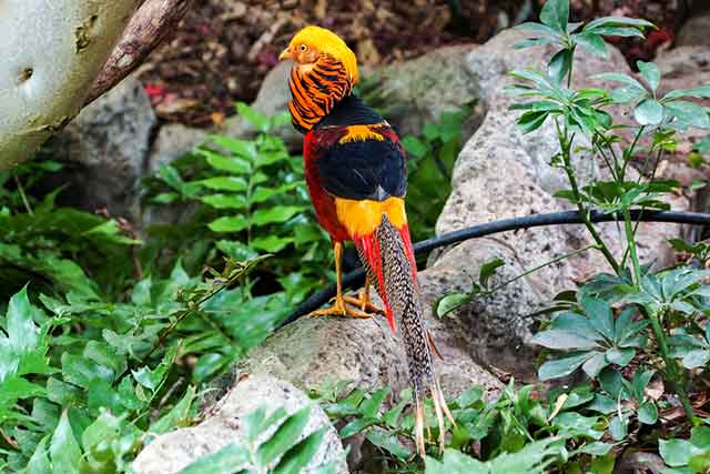
Golden pheasant
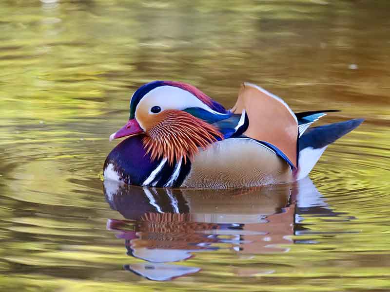
Mandarin duck

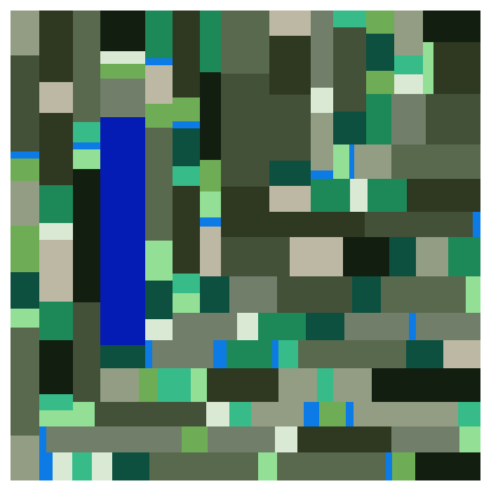
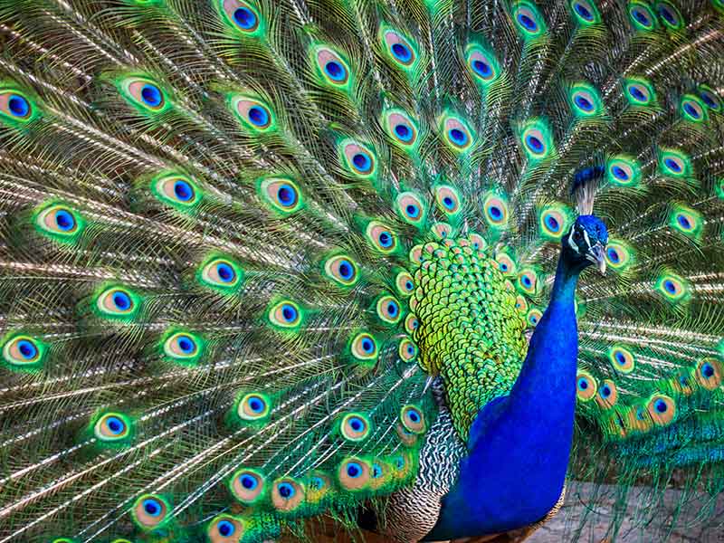
Indian peafowl
In this case I didn’t remove the background because the bird already took up the entire frame. I set the number of rectangles for all colors but one shade of blue to quite high to mimic the pattern of the tail of this blue bird.
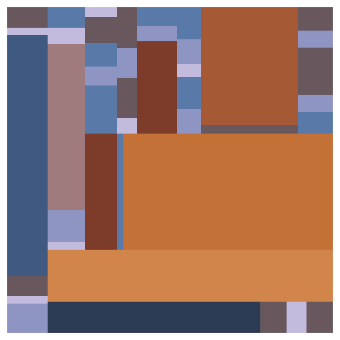
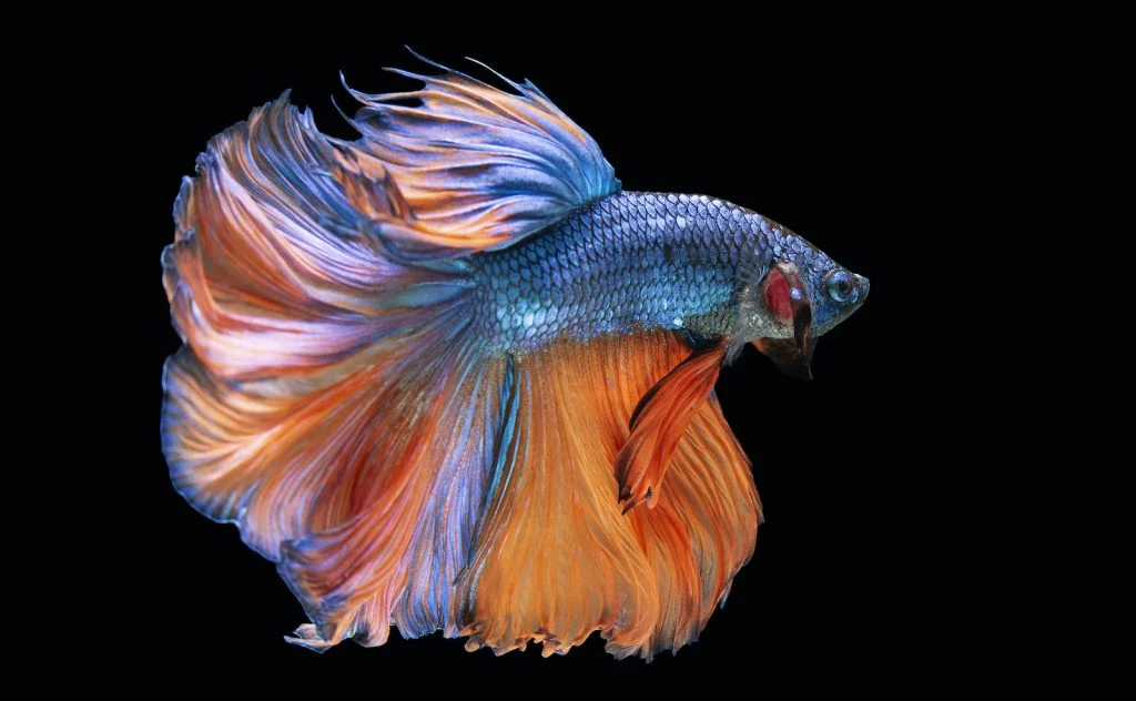
Halfmoon betta fish
Instead of just birds we can also use pictures of other animals, like this Halfmoon betta fish.
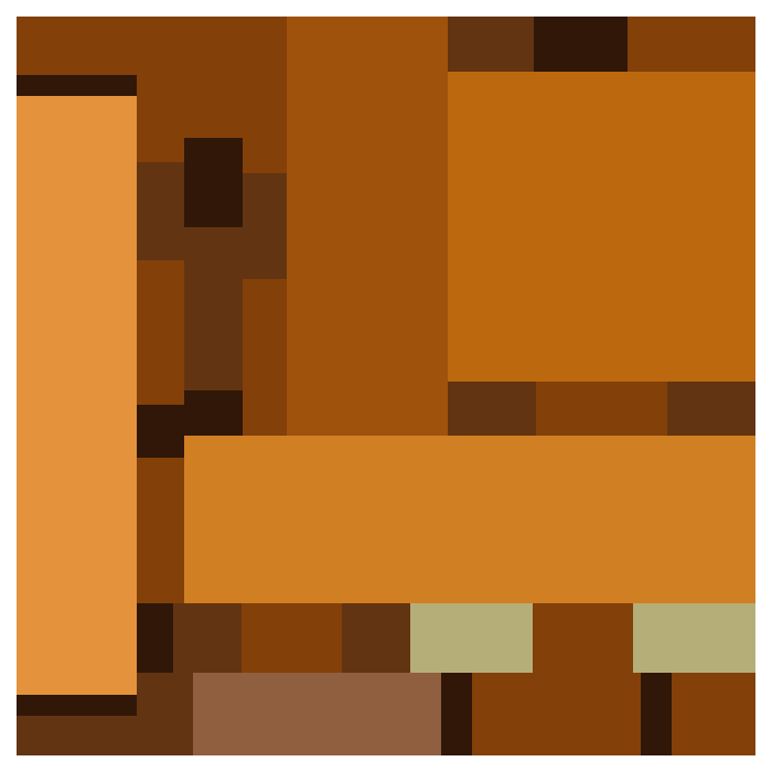
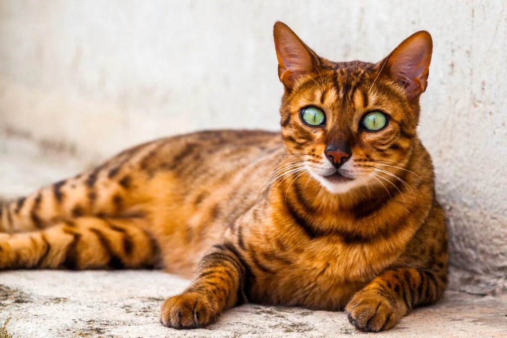
California spangled
Or we create an abstract of the California spangled. I set the number of rectangles to two for green to mimic the eyes.
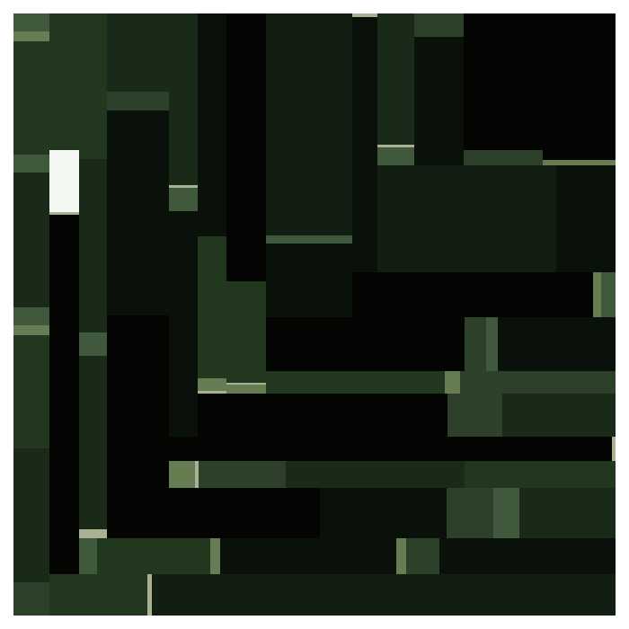
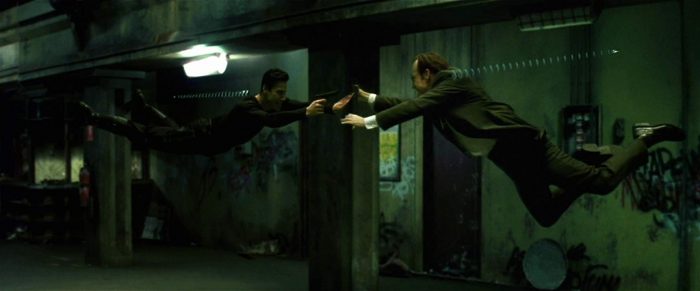
The Matrix
Instead of animals we can use a movie still.
BLACKPINK
Or perhaps you’re more into the visual aesthetics of BLACKPINK’s DDU-DU DDU-DU.

Creating your own artwork
If you want to create your own piece of art, check out one of the following links:

![]()
![]()